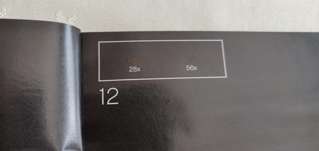
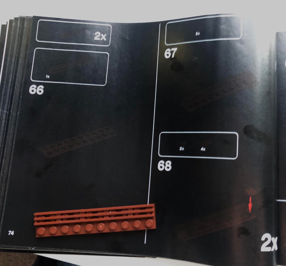
There has been a growing concern for the way all instruction manuals have been printed in the new 18+ ‘Adults Welcome’ theme.

Image source unknown
Having a dark background has effected many AFOLs in the ability to get through a build without straining their eyes or moving the manual around in order to see the next step. I know I’ve had that happen to me, mostly when building last Years LEGO Crocodile Locomotive set!

©Comic Sans Galore
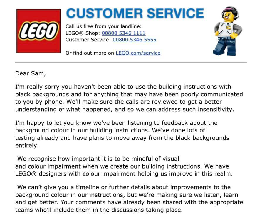
This prompted many of us to send in our feedback on the issue, with one AFOL, Sam Walker, receiving a response from LEGO Customer Service…

©Sam Walker
The pages do of course require a greater amount of black ink, surely making it less environmentally friendly. The move back to lighter coloured pages would indeed benefit everyone in this instance and bring back that feeling of enjoyment to a build and not one of struggle and headaches due to eye strain.
I personally like the new 18+ box designs and would love for them to continue, but having easier to read and ultimately follow instruction manuals is certainly the way forward here. What are your thoughts on the subject, do you like the darker pages? Let us know in the comments below.
What is your reaction?
 YES!
YES!
 I like it
 It's OK
 Not Sure
 No!
No!


